My 3 best volatility indicators

These volatility indicators will help your trading fit the ways markets are behaving right now, so your strategies can naturally adapt and change (the only way to survive in a changing world) …
What is volatility?
A volatile market is one that’s making big moves (relative to its size). Volatility is simply a measure of those ups and downs.
If you were to look at the price chart for a volatile market, it will look something like a terrifying rollercoaster ride. While the price chart for a stable market will be more like a gently meandering stream.
Some markets are naturally more volatile than others, but each market will go through periods of high volatility and low volatility, often triggered by global trading conditions. Generally speaking, a falling market is likely to be more volatile than a rising market, as prices tend to drop suddenly as traders panic, while they tend to rise steadily on a wave of optimism.
Why volatility matters
If the market is making big moves, your stops (and targets) are more likely to be hit … if the market is sluggish, you could be hanging around (with your money at risk in the market) waiting for prices to find a direction.
What we need is a simple way to measure this … and to adapt our trading to suit.
Fortunately, help is on hand with the volatility indicators!
Here’s my pick of the best, the most useful, and how to apply them to your trades …
Bollinger Bands
I’m a huge fan of Bollinger bands – they’re one of those great indicators that you only have to glance at to see what’s going on.
Based on a moving average, Bollinger bands can be used in a number of ways, but here I’m going to focus on the information they give us about volatility. They take the form of two lines, or bands that run in a channel either side of the price. These levels are based on the deviation of the price from its 20-day moving average. If the price is volatile, the bands will be wide; if the price is stable, they’ll come closer together.

When volatility on an instrument suddenly decreases, it’s often followed by a big breakout – and that’s what traders look for from a ‘Bollinger squeeze’. This is when the two lines move in tight as volatility declines. This is a signal popular with breakout traders, as it’s often followed by an explosive move.
Average True Range
The average true range indicator is so simple, yet one of the most useful tools for traders.
All it does is measure the average trading range over a set number of periods. So, if you want to measure volatility over the last 14 days, open a daily chart, set the ATR to 14 … and just read the level it gives.

So, what’s so special about this information?
Knowing the average move our market is making over a set period is incredibly useful when it comes to setting our targets and our stop levels. If the price usually moves 50 points in a day, then placing a 20-point stop could leave you vulnerable. Likewise, if your market often makes moves of 80 points or more in a day, then a profit target of just 10 points may not be ambitious enough.
Getting this right is about looking at the timeframe you’re trading, and matching the market moves to that.
The broker I use has really useful ATR tools – ones that make applying the ATR to actual price moves much simpler and more intuitive.
These are 2xATR bands drawn on a 10-minute chart …

This is a great – and very visual – way to set reasonable stop levels and profit targets, showing on your chart how far you can expect the price to move within the timeframe of your trade.
You can also use the ATR Trailing Stop option, which uses similar data to plot a potential trailing stop on your chart …

The VIX
The two volatility indicators we’ve looked at above are ones that I refer to again and again when placing trades, and I’d go as far as saying that you shouldn’t place a trade without a good idea of what the average true range on your instrument is.
The final indicator I want to look at is quite different, and gives a ‘big picture’ of what the wider market sentiment is.
It’s more commonly known as the fear index, and less commonly as the CBOE Market Volatility Index.
The VIX was first established in 1993, and it is calculated on a weighted blend of prices for a range of options on the S&P calls and puts. You don’t need to worry about the actual calculation, but the gist is that traders will buy put options as insurance when they are worried about market conditions. When lots of traders are worried, the price of these put options goes up – and the VIX level measures this. So, in essence, it is a gauge of investors’ confidence in the market.
The VIX, in general, has an inverse relationship to the market. The VIX goes up as stocks decline, and the VIX declines as stocks advance. A low VIX means that traders are confident about market conditions. A high VIX means that they are fearful.
This historical chart shows how the two instruments correlate to each other …
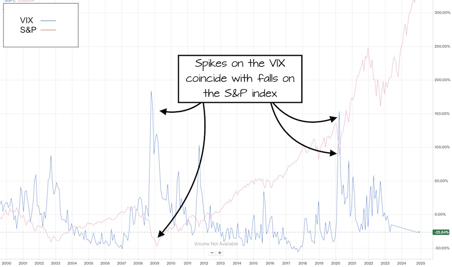
Note how most major falls on the S&P are preceded by a sharp rise on the VIX index. And this is why traders are mindful of VIX levels.
But it’s not just rising VIX levels that make traders nervous. When the VIX hits new lows, it’s generally accompanied by warnings that the market has topped out. Nothing forecasts a market crash better than complacent investors!
But isn’t the VIX broken?
The muted response of the VIX during market turbulence in 2022, led to many investors deciding that the VIX was ‘broken’ as a tool to measure volatility. And it’s definitely true, that the VIX doesn’t respond quite the way it used to.
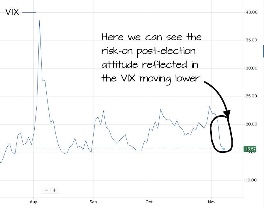
A rise in the availability of short-dated options, means that those measured by the VIX just don’t get the level of demand we’ve seen in the past. However, the VIX still responds, just in a more subtle way. And we can see the VIX moving lower this week, as stocks have risen …
Combining indicators
You can find details of my top trend indicators HERE, plus momentum indicators HERE.
To enjoy more content and get it faster Follow @TradersBulletin


JOIN US ...
Get full access to members-only resources, plus my weekly email updates ...
I will NEVER share your details for marketing purposes. Privacy policy
Strategies I'm Using
 It has taken 2 years to persuade this market…
- These videos show how to make 24% gains in…
 As you can see from all the data I've…
 Get the low down on the Heikin Ashi Mountain…